

The Making of Nagariyal's Name and Logo
- Aishwarya Soni

- Feb 15
- 5 min read
Until recently, if you searched ‘Nagariyal’ on Google, you’d likely have found results like these — much like what I saw five years ago when I first heard the word. Google would ask, “Did you mean: nariyal?” (nariyal means coconut in Hindi).

So what does Nagariyal mean?
In Tamizh, there is no equivalent for the word “urbanism,” which led us to coin our own. Nagariyal combines the noun "nagar" — meaning city or urban in several Indian languages — with the Tamizh suffix "-iyal". Akin to "-logy” in English, “-iyal” is used to denote fields of study or systematic disciplines. Nagariyal, thus, is a new term that stands for urban studies or urbanism.
The name Nagariyal is also shaped by the place. For all of us at Nagariyal, Chennai and Tamizh Nadu have been the foreground and background against which we learnt and built our understanding of cities in all their diversity and complexity. Yet, there are very few organisations that focus on urbanism in Tamizh Nadu and even fewer that communicate in Tamizh. Our name, therefore, also signals our geographic and linguistic focus.
This naturally led us to our next question, how does one express “urbanism” visually in Tamizh? To us, a key visual for urbanism is the street, be it as a single entity or as a network. This in many ways is also influenced by our time at the Institute for Transportation and Development Policy (ITDP), where we came to see the street as the most fundamental, democratic, and contested unit of urban space through which people truly experience a city. With that idea, we developed a very short list of requirements for our logo:
Must be associated with streets
Must integrate English and Tamizh to reflect the bilingual identity
Must have a pop of yellow (no reason, we just like yellow)

First doodles of the word Nagariyal to visualise the English and Tamizh text placement by Santhosh. Image source: Santhosh Loganaathan.
Seeing the English and Tamizh text instantly brought to mind the mustard-coloured handwritten street signs of Chennai. If you’ve walked through the city’s older neighbourhoods, you’ve likely seen them. At ITDP’s Chennai Adyar office between 2017–2020, one such signboard famously doubled as a makeshift coffee table.

We stumbled upon some fantastic photographs of Chennai's street signs in a blog by Nia Murphy. Studying them upclose, we analysed their text hierarchy, character spacing, decorative strokes (serif extensions or “feet”) at the letter ends, and the English and Tamizh text layout.


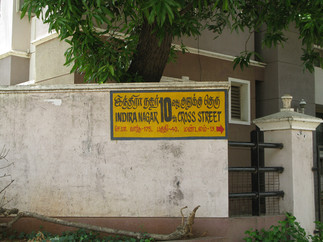


The font composition and styling would vary between each of them, as "sign painters work on the spot, not in a distant office, and they work with the space they have. This is painter as designer". Image source: Nia Murphy.
For instance, the English text was written in uppercase to achieve a uniform height without tall or hanging letters ("ascenders" or "descenders", as they are technically called). In some cases, you’d notice a stylised K or R with the tail extending, as seen in the Indira Nagar and Kottivakkam Kuppm signs, a design choice completely left upto the sign artist’s discretion. Tamizh is a unicase script i.e it does not have uppercase or lowercase, and its letters have distinctive curves, loops, and jots. When placed beside English text, these extend above and below the height of the English letters.

Though we knew what our logo needed to look like, it wasn’t just as easy designing it. One challenge was finding the right English and Tamizh fonts that could replicate the handpainted aesthetic while complementing each other. English brush and handwritten fonts turned out to be too slanting or too round or too playful or too textured, did not have the desired serif extensions, and did not look balanced when paired with the available Tamizh fonts.

I tried tracing over the letters in the street sign photographs, but zooming in to that scale lowered the resolution, making the letter shapes hard to distinguish. We briefly considered hiring a sign artist to paint the logo, but it wasn’t feasible given budgets, logistics, and time. Then, as any bootstrapped founder with reasonable artistic skills would do, I attempted to handpaint the logo myself, despite not knowing how to read or write Tamizh.

That’s when the breakthrough came. Similar to how I first wrote the words and then painted on the serif extensions, I realised that I could add these serif extensions to any font, so long as the letters had varying thicknesses to suggest that they were made using a paint brush.

90% there. All that was missing was something hand-drawn. So as a finishing touch, we added two very thin guidelines, as a nod to the traditional sign-painting process in which the lines guide the height of the letters.


As for the rest of the colour palette, we just looked around in our studio to spot objects with shades of aqua or teal that could contrast with the yellow. One was a lid of our snacks box with banana chips and murukku, and the other was the ‘Simply Economics’ book cover. Choosing some parts of our identity was really that simple.

And that’s how Nagariyal’s visual identity came to be, over four days. The process was messy, non-linear, layered, iterative, but needed to be rooted in context, just like how city-making is.

And what joy to finally be able to change the Google search results for Nagariyal, from this:
to this:

With the identity now set, what matters most next is the work we do and the questions we pursue. We are a small team but have mighty ideas to rethink our cities. Come, follow us along in our journey.
Studio notes is a monthly blog where we share glimpses of the often unseen work at our desk — covering research, writing, design, data analytics, and map-making.
I absolutely love this process and end signage/logo :)